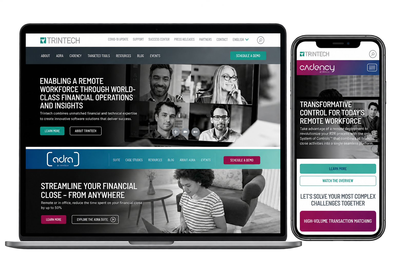
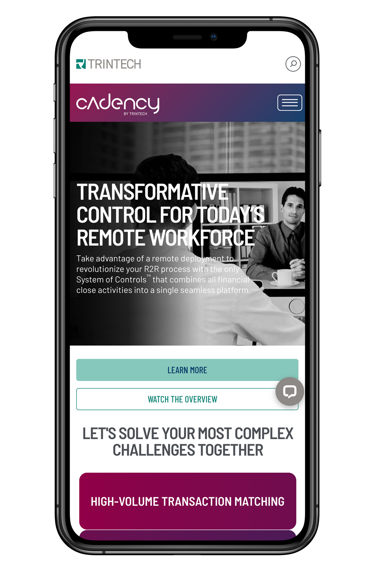
One master identity
Created a modern, cohesive master brand — logos, color palettes, imagery and messaging — that could hold Trintech's products together.
Corporate rebrand
One brand family. Clearly distinct.
Trintech, a leader in financial close software, had grown into a sprawling brand without a unifying vision that needed a master identity that could hold its products together while keeping each of them unique.
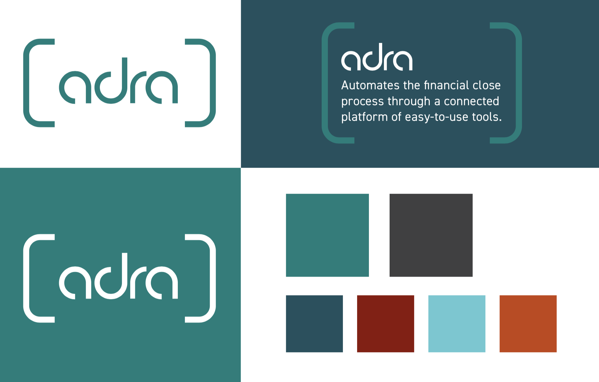
The rebrand created a modern, cohesive master identity while drawing a clear division between Trintech's ADRA and CADENCY product lines.
New logos, color palettes and imagery carried the family-and-division idea across brand guidelines, messaging, websites and animated product videos.
The system extended into templates, sales documents, ebooks, banners and posters — one brand family built across every surface the company touches.
Unify a financial close software leader under one modern master identity while making its ADRA and CADENCY product lines clearly, usefully distinct.
Created a modern, cohesive master brand — logos, color palettes, imagery and messaging — that could hold Trintech's products together.
Drew a clean visual division between ADRA and CADENCY so the product lines read as part of one family without blurring into each other.
Rolled the system into websites, animated product videos, templates, sales docs, ebooks, banners and posters for a coherent brand estate.
Trintech launched a cohesive master identity with a clear visual division between ADRA and CADENCY, rolled out across websites, product videos, guidelines and the full sales and marketing toolkit.